
How to customize button colors and style
Make the try-on button match your store's branding by customizing the button colour, label, position, and theme in the Widget appearance page.
Accessing widget settings
Open MirrorNex
Go to Apps → MirrorNex in your Shopify admin.
Navigate to Widget appearance
Click on Widget appearance in the navigation menu.
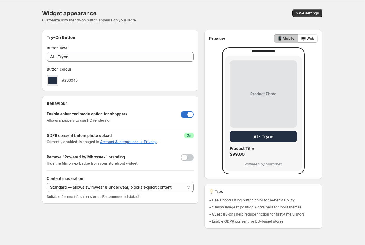
Try-On Button settings
The Try-On Button card contains all the visual customization options:
Button label
The text displayed on the button. Default is "Try it on". Enter any text you prefer (see button text ideas).
Button colour
Click the color picker to choose your button background color. You can also enter a hex code directly. The default is a purple (#6C2BD9).
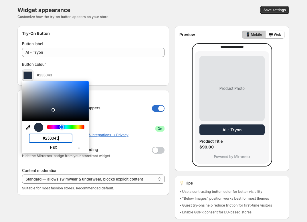
Position
Choose where the button appears on the page:
- Below Images — Button appears below the product image gallery (most common)
- Floating — Button floats in a fixed position on the screen
- In Gallery — Button appears overlaid on the product image
Theme
Choose the overall widget theme:
- Light — Light backgrounds with dark text (default)
- Dark — Dark backgrounds with light text
Preview your changes
As you adjust settings, the Preview panel on the right shows how the button will look. You can toggle between:
- 📱 Mobile — See how it looks on phones
- 🖥️ Web — See how it looks on desktop
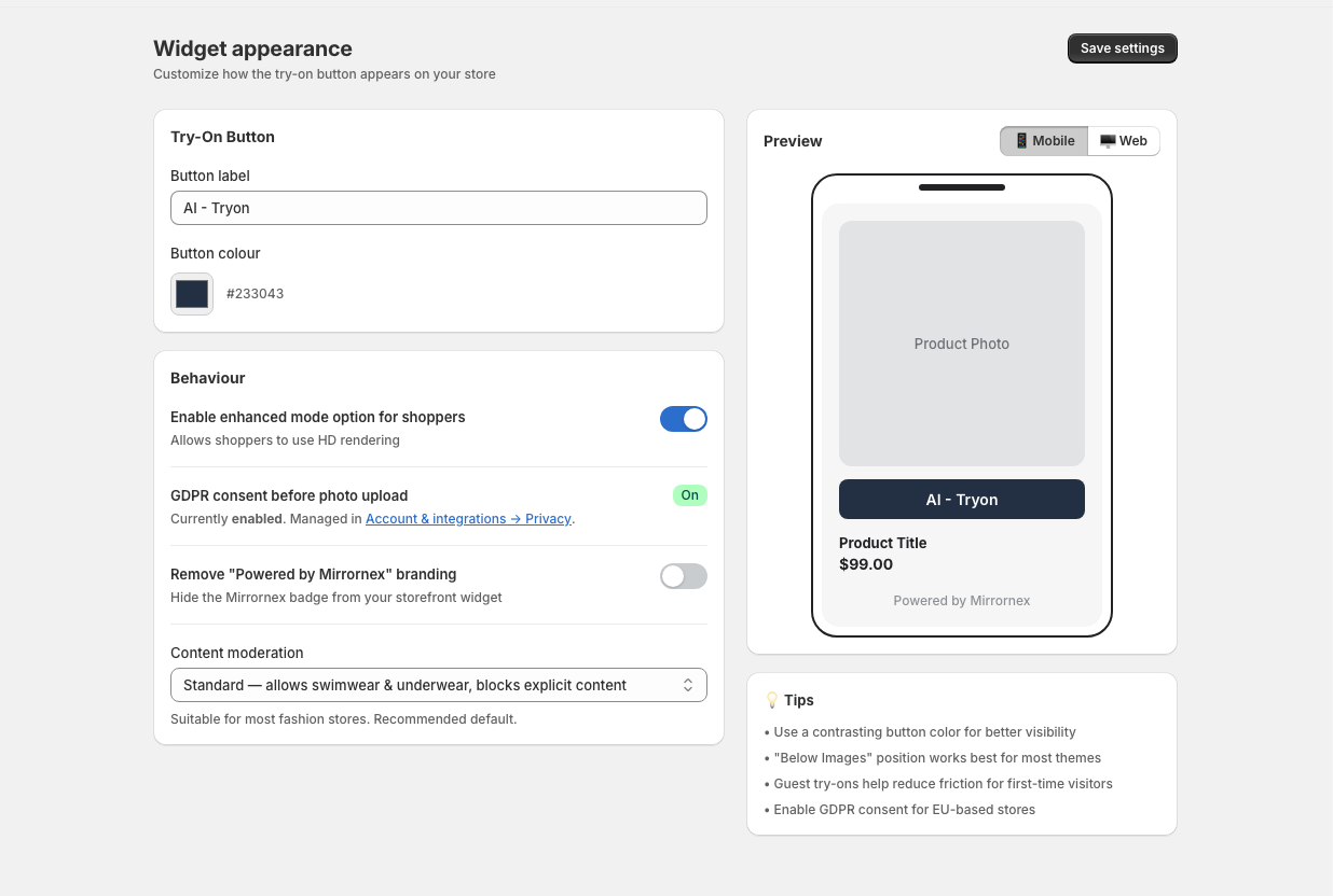
Saving your changes
Click Save settings at the top right of the page. Changes apply immediately to your live store.